-
- Industry:
- Payments
- Banking & Finance
-
- Client:
- KLP
-
- Category:
- Brand Identity
- Motion Design
- UX/UI Design
- Illustration
- Environmental
Challenge
KLP’s vision is to be “the best partner for the days to come”. Through research we found that KLP were struggling to communicate the expertise that underpins this. They weren’t managing to stand out amongst competitors. The values that define their business were not resonating with potential customers.
This then became the very core of our challenge. We needed to provide the platform and framework that would empower KLP to actively show customers how they take of them through the financial trials and tribulations of life. It was essential that any communication should make KLP be perceived as the most reliable and obvious alternative on the market.
Solution
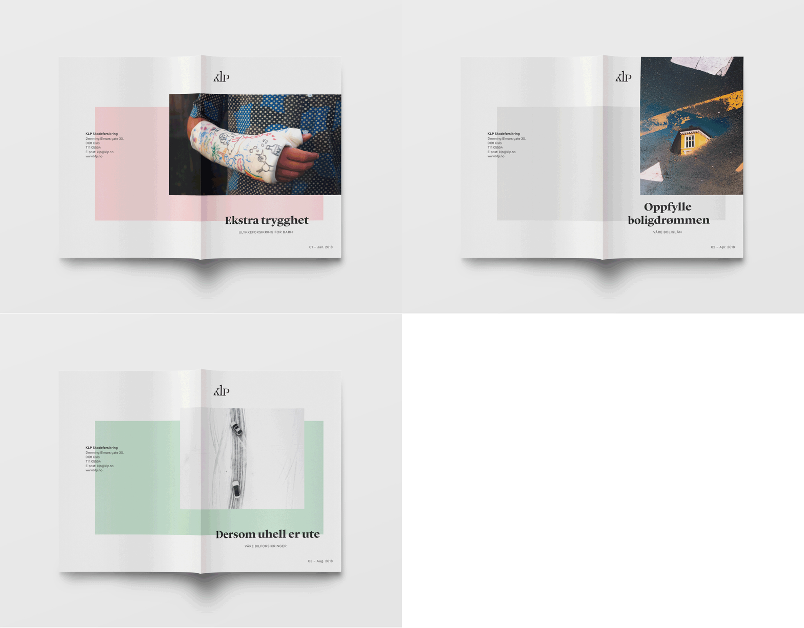
The process of breathing new life into the visual identity started off with a methodical approach. We began with a total mapping of KLP’s communication, values and brand strategy. The new strategy highlighted the spaces that KLP should associate themselves with, providing a framework to position themselves towards their different audience groups. Shifting our foreground focus on the core narrative of being the company that offers the best solution for all the important things in life, through the identity we showed how customers are taken care of through life’s ups and downs.
Impact
The result is a visual and communicative expression that is humane and warm, one that emphasises the close and safe environment KLP creates. The concept “Ivaretatt” communicates that KLP is a company that cares for you and your life. It runs through the visual, spoken word, written word, and through all the services they design and develop. This process achieved a new enlightened understanding of KLP’s role in the market, laying a foundation that has been the catalyst for reinvigorated employee pride and engagement.
Norway’s largest life insurance company
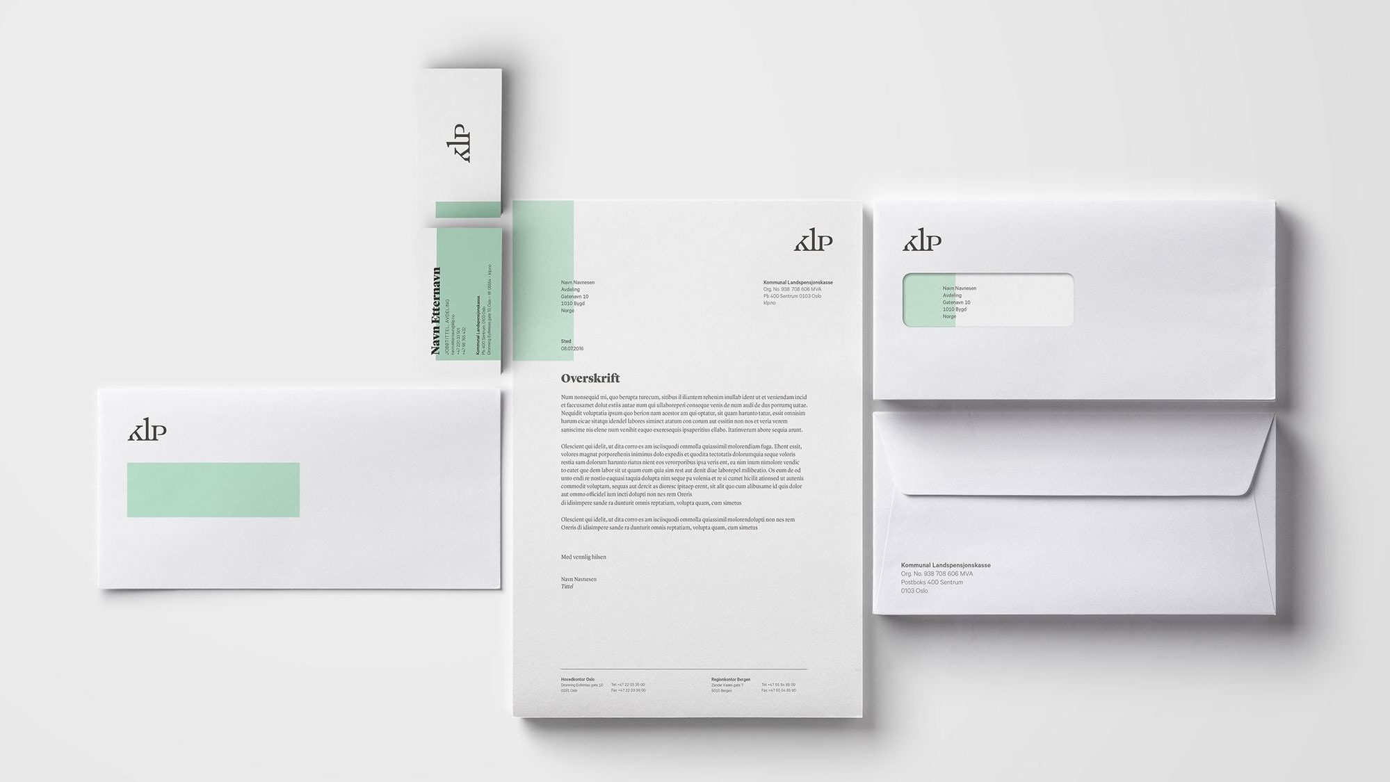
KLP (Kommunal Landspensjonskasse) is Norway’s largest life insurance company. In 2016 they requested a revitalisation of their identity, and we were chosen to perform the honorable task. Communicating KLP’s vision and values, the challenge included mapping a new brand strategy, while developing a complete and united supporting identity – both for internal and external communication
- Brand Identity
- Motion Design
- UX/UI Design
- Illustration
- Environmental
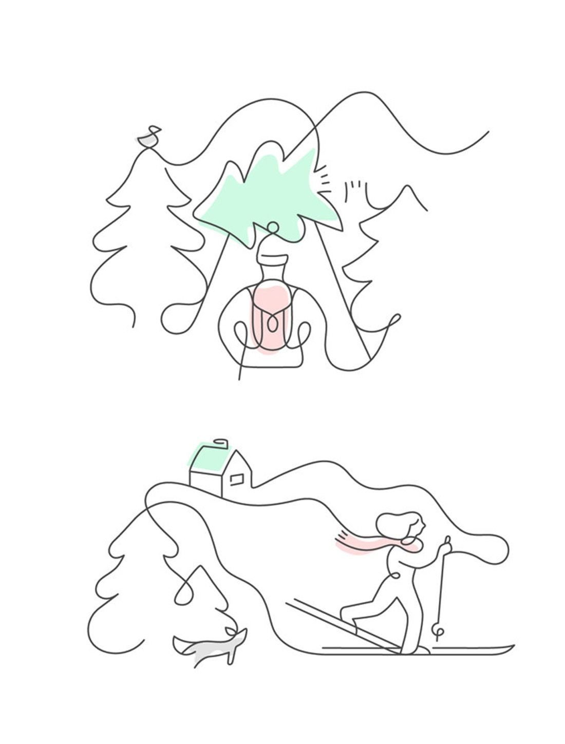
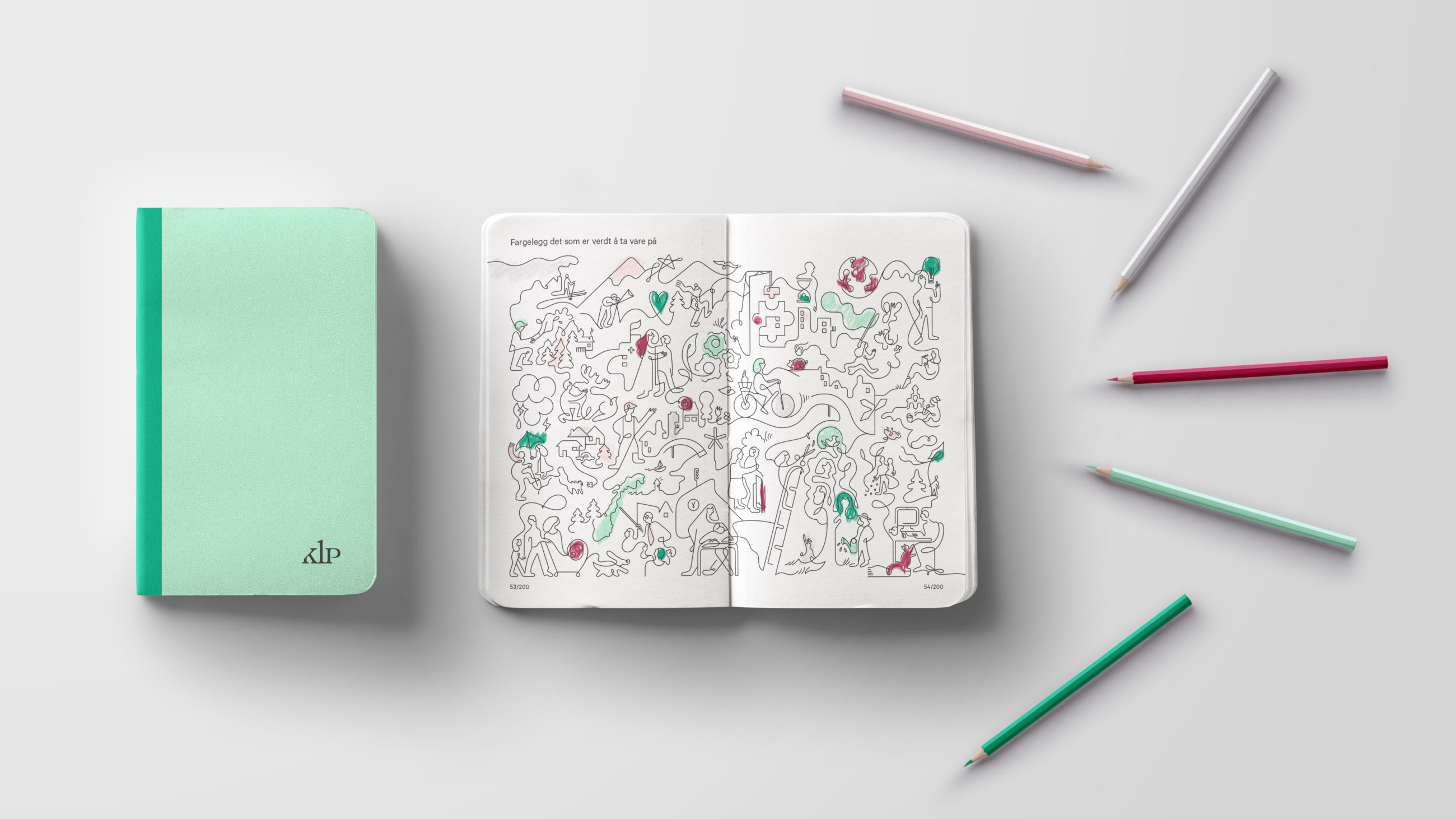
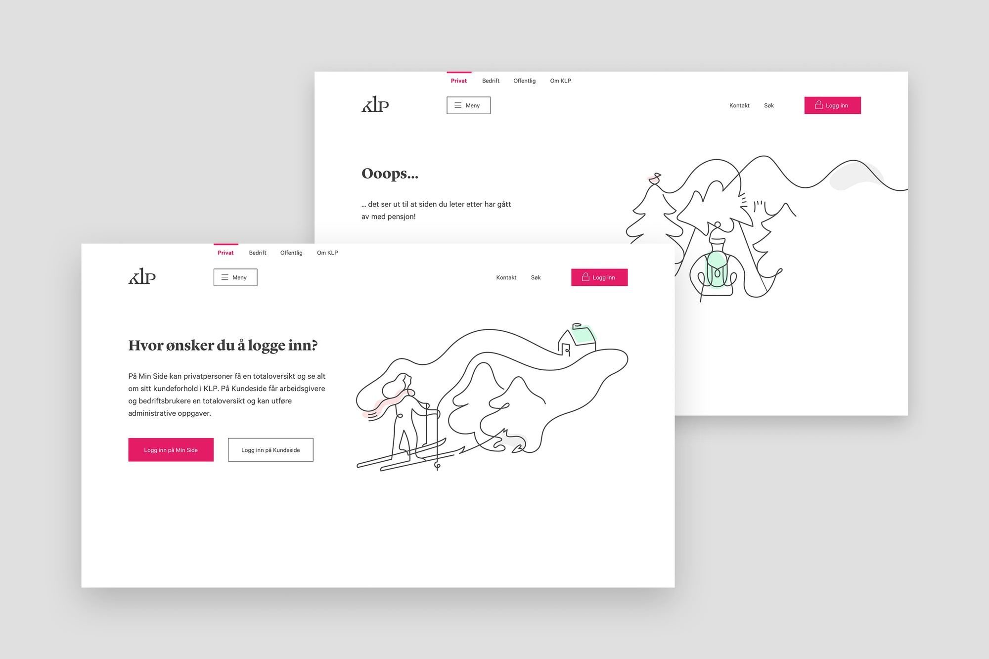
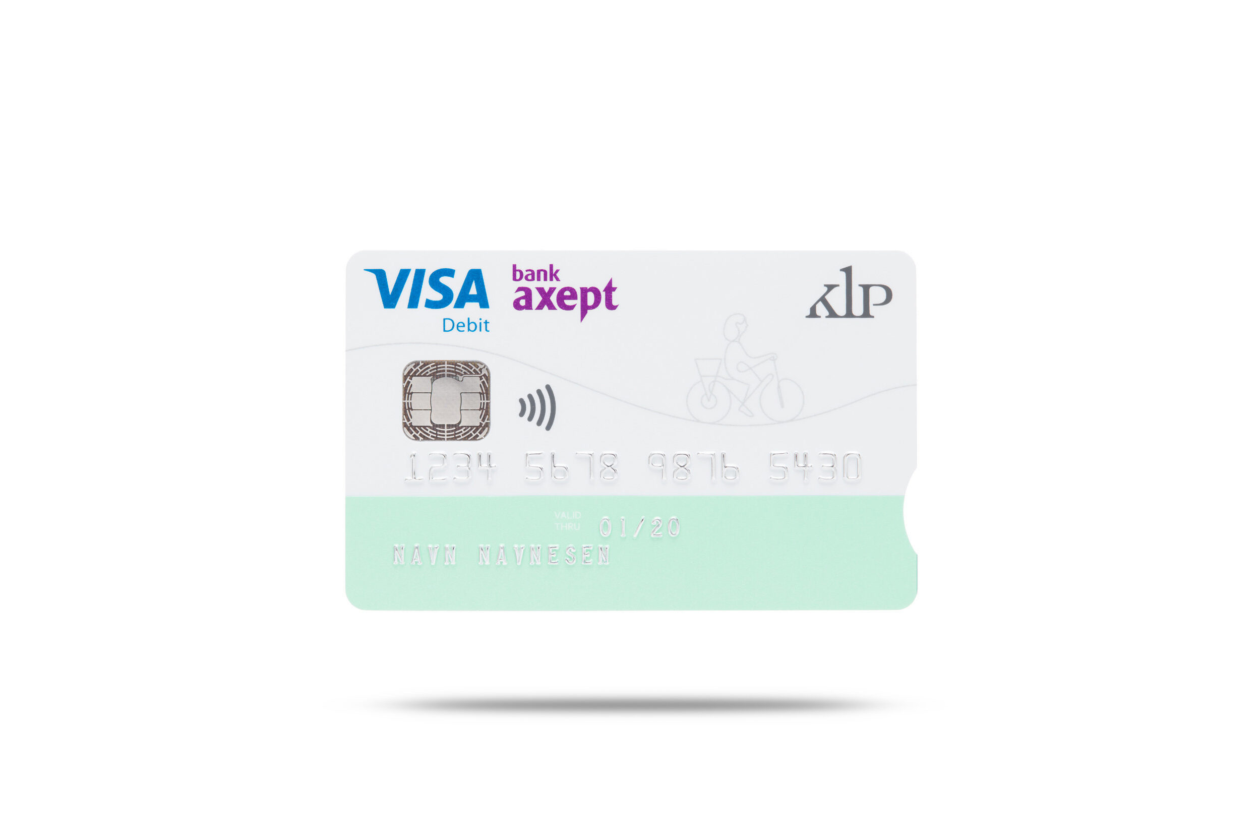
The illustrations create life; playful engagement and builds character into the toolbox. The continuous line refers to the pulse and the course of life. They have a functional and explanatory role that supports the underlying communication strategy.
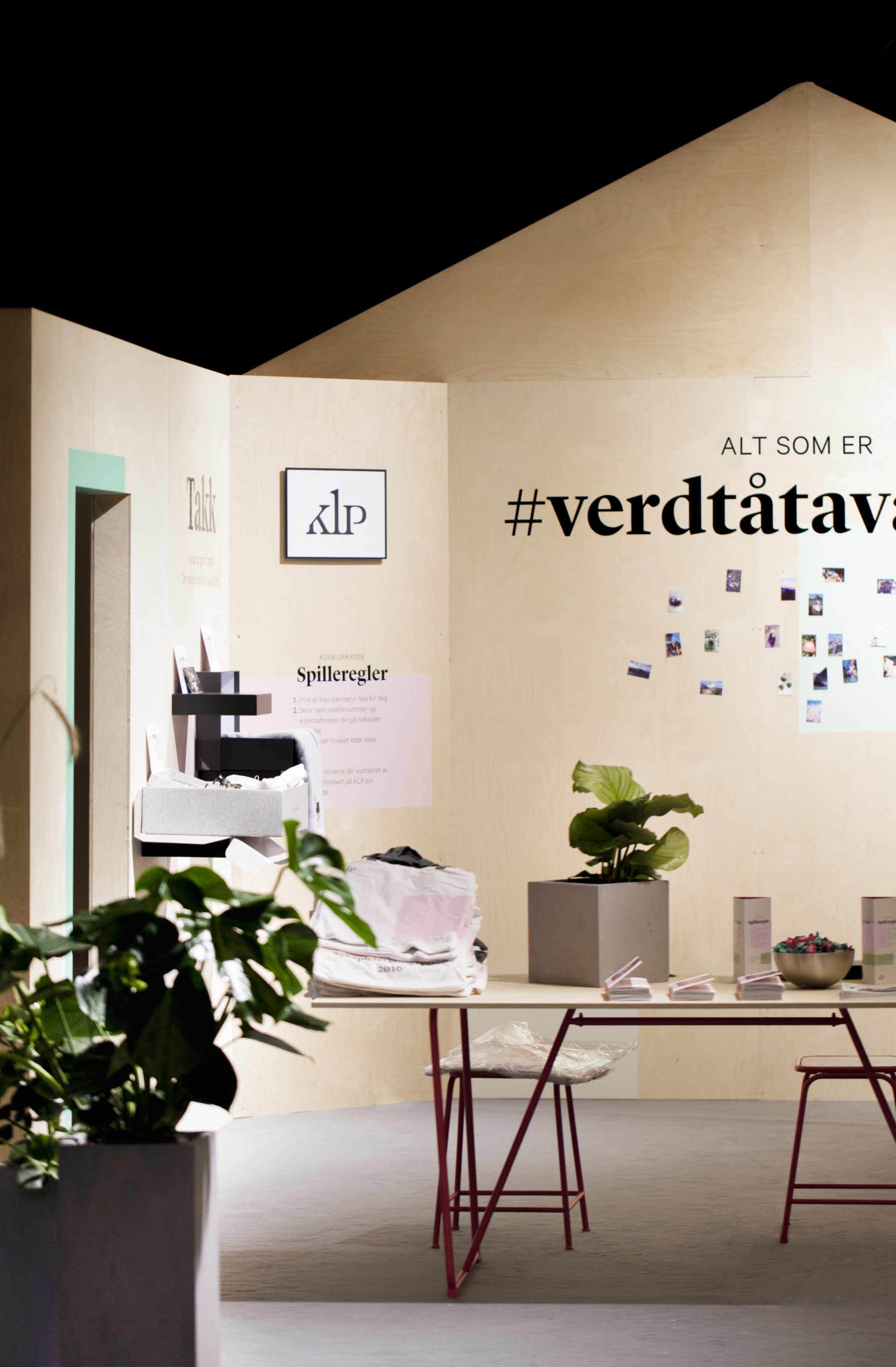
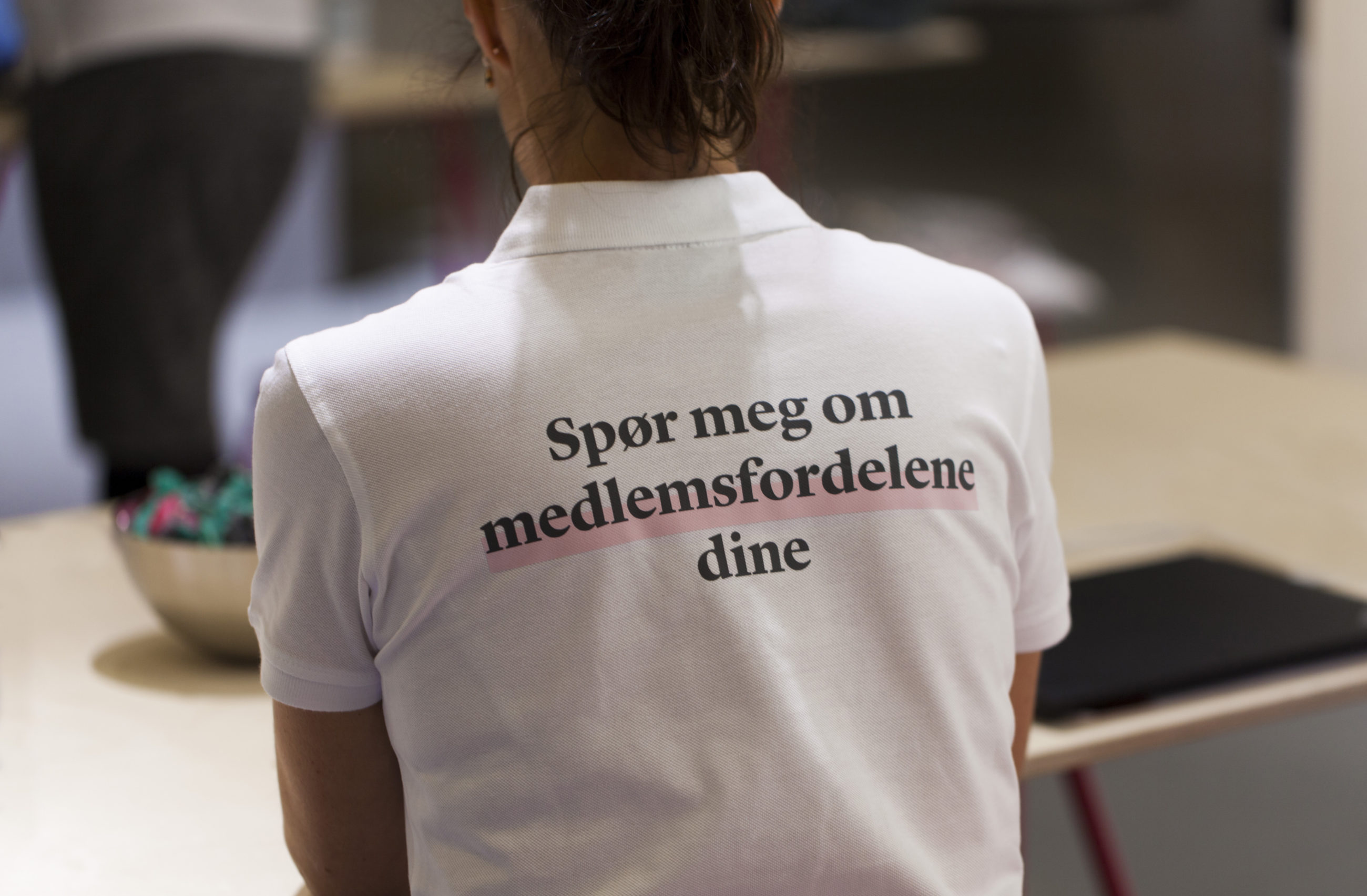
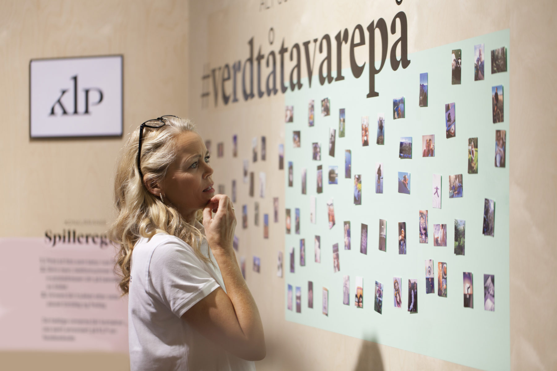
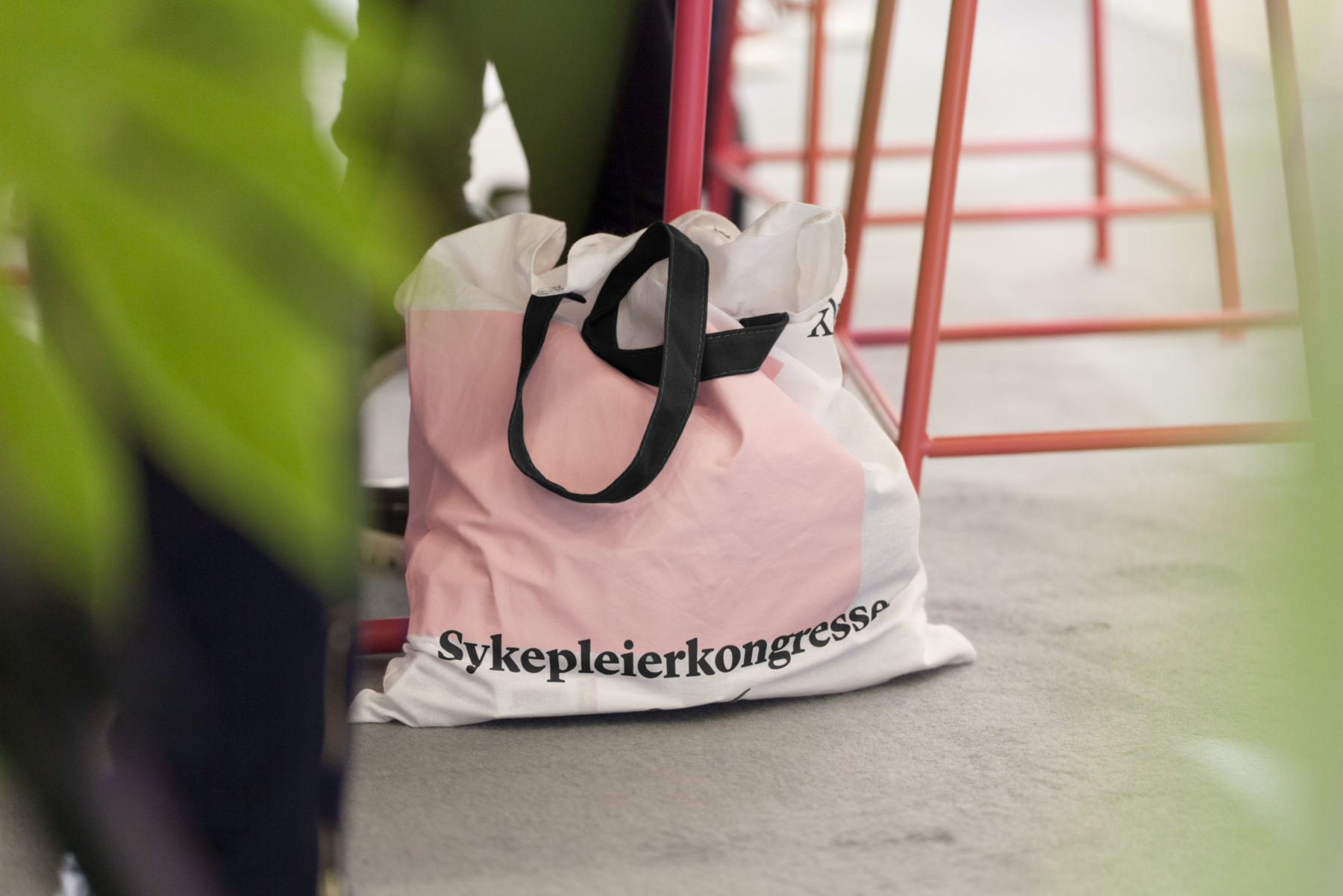
Nurses are an important target group for KLP. In September 2016, a big conference for nurses was held in Oslo. As a key arena for an important target group, we wanted to express our gratitude toward the people who dedicate their lives to take care of others.
